I’ve discovered the real approach isn’t filling every space—it’s choosing three key pieces and stopping there.
Pick one metal finish to match your kitchen hardware, then select two neutral tones like cream and taupe for calm consistency.
Space your pieces 12–18 inches apart so each item has room and feels deliberate rather than crammed.
This restraint keeps your cabinets organized and visually balanced, making your kitchen feel more peaceful instead of cluttered, and there’s much more to learn about pulling this off correctly.
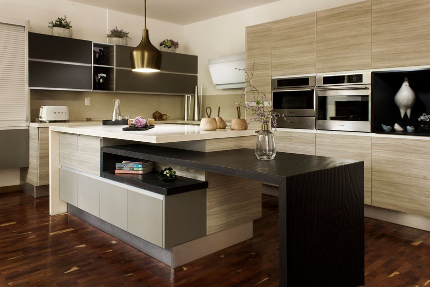
Choose Statement Pieces Above Your Cabinets: Then Stop

Why do we feel the urge to fill every empty space? I’ve learned that restraint turns upper cabinets into galleries, not storage shelels.
I choose three pieces for my space above cabinets—nothing more. A large white pottery vase. A sculptural modern piece. A farmhouse basket. Each gets breathing room.
Scale and simplicity matter most. I repeat materials already in my kitchen—copper accents, neutral tones—creating harmony rather than chaos. This balanced display feels deliberate, not random.
Empty space itself becomes decor. Those visual breaks between pieces calm my mind. I’ve stopped fighting the urge to overfill. Instead, I celebrate what I’ve removed.
Clutter-free shelving above cabinets provides visual interest through restraint. That’s belonging—creating a home that feels peaceful, not overwhelming.
Unify Your Look: Match One Metal and Two Neutrals

Now that you’ve chosen your three pieces, here’s how to make them work together: pick one metal finish and stick with it.
I recommend choosing between brass, chrome, or bronze for your decorative accents above cabinets. This consistency creates a unified appearance across your kitchen. Match that metal to your hardware or lighting fixtures elsewhere in your kitchen for visual harmony.
Next, select two neutrals: maybe cream and taupe, or white and gray. Vary their texture with ceramic, woven, and glass pieces, but stay within those two colors. This keeps your kitchen decor calm and prevents visual clutter.
Here’s what works about this approach: you can easily swap accessories within your neutrals without disrupting the established metal accent. Your backsplash pairing and home styling stay streamlined and organized.
Space Objects 12–18 Inches Apart for Visual Breathing Room

Once you’ve picked your pieces and unified your metals and neutrals, here comes the part that actually makes everything look intentional: spacing. I space objects 12–18 inches apart to create visual breathing room above cabinets. This gap prevents that cluttered, overwhelmed feeling and lets each piece shine. Your cabinet display needs room to breathe.
When I arrange larger decorative pieces with intention, the space above cabinets changes. Fewer, bigger items read as modern and balanced—way better than cramming tiny things together. I adjust decor spacing based on my ceiling height and cabinet length. This cabinet-to-ceiling decor approach keeps my uncluttered look consistent.
A consistent color palette across spaced items reinforces unity with kitchen finishes. This intentional display makes everything feel connected, like I actually planned it all along.